
D&AD IMPACT - WHITE PENCIL 2016
Responsible production & consumption
TYPEFACE DESIGN
The world's most beautiful sustainable font
D&AD IMPACT - WHITE PENCIL
Responsible production & consumption 2016
CLIENT: Ryman
AGENCY: Grey London
PROJECT TASKS: Typography, Font Design.
CREDITS: Dan Rhatigan (Monotype)
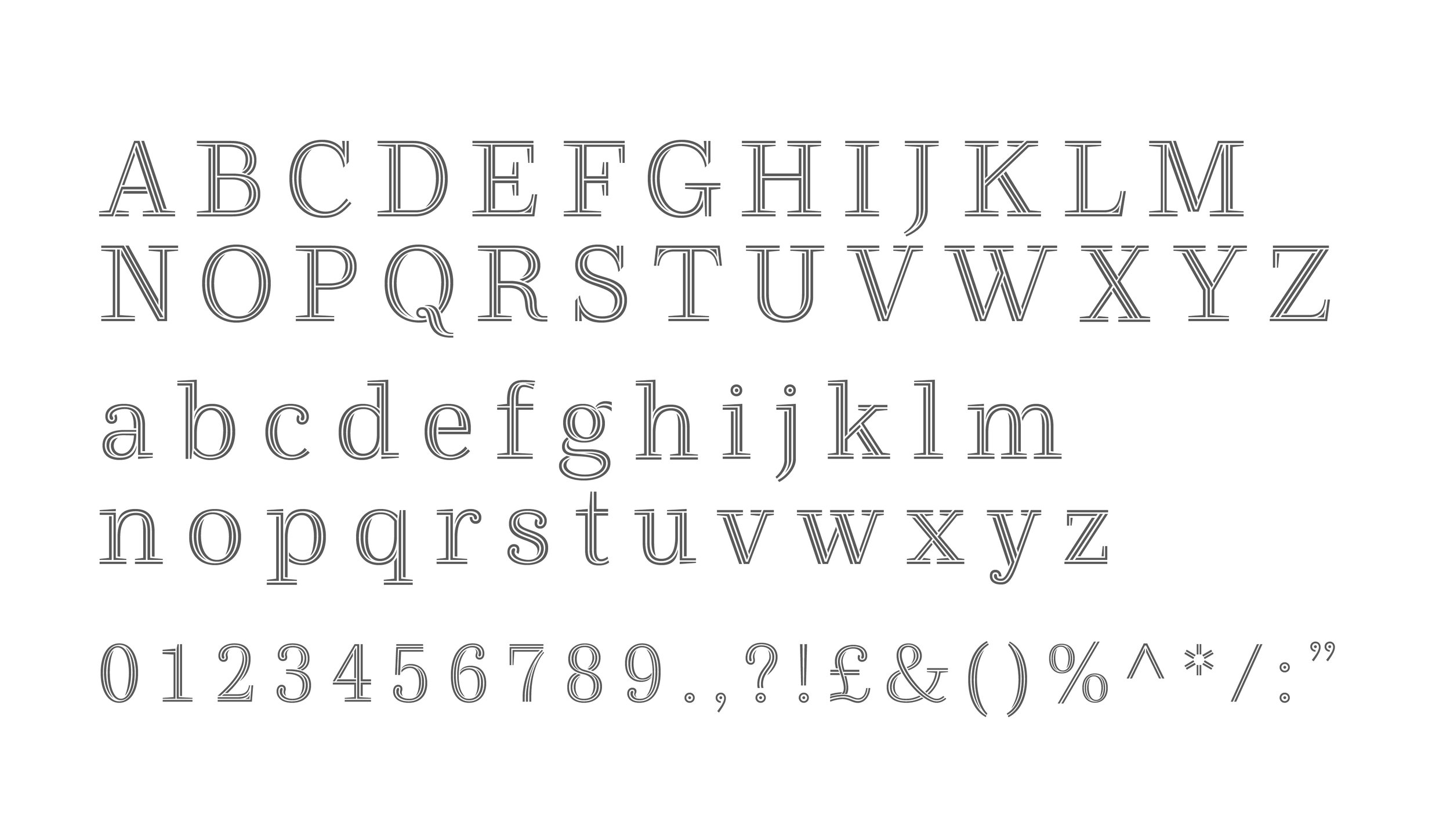
THE WORLD'S MOST BEAUTIFUL SUSTAINABLE FONT
The entire concept for Ryman Eco is about the final print experience and finding the perfect balance between saving ink, legibility, and aesthetics.
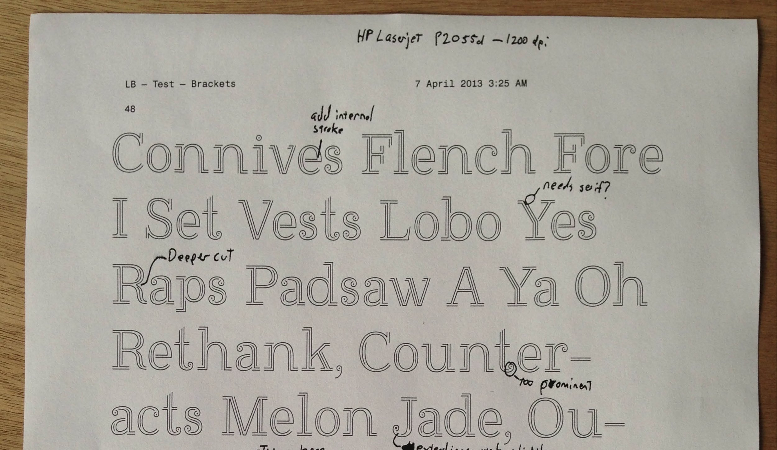
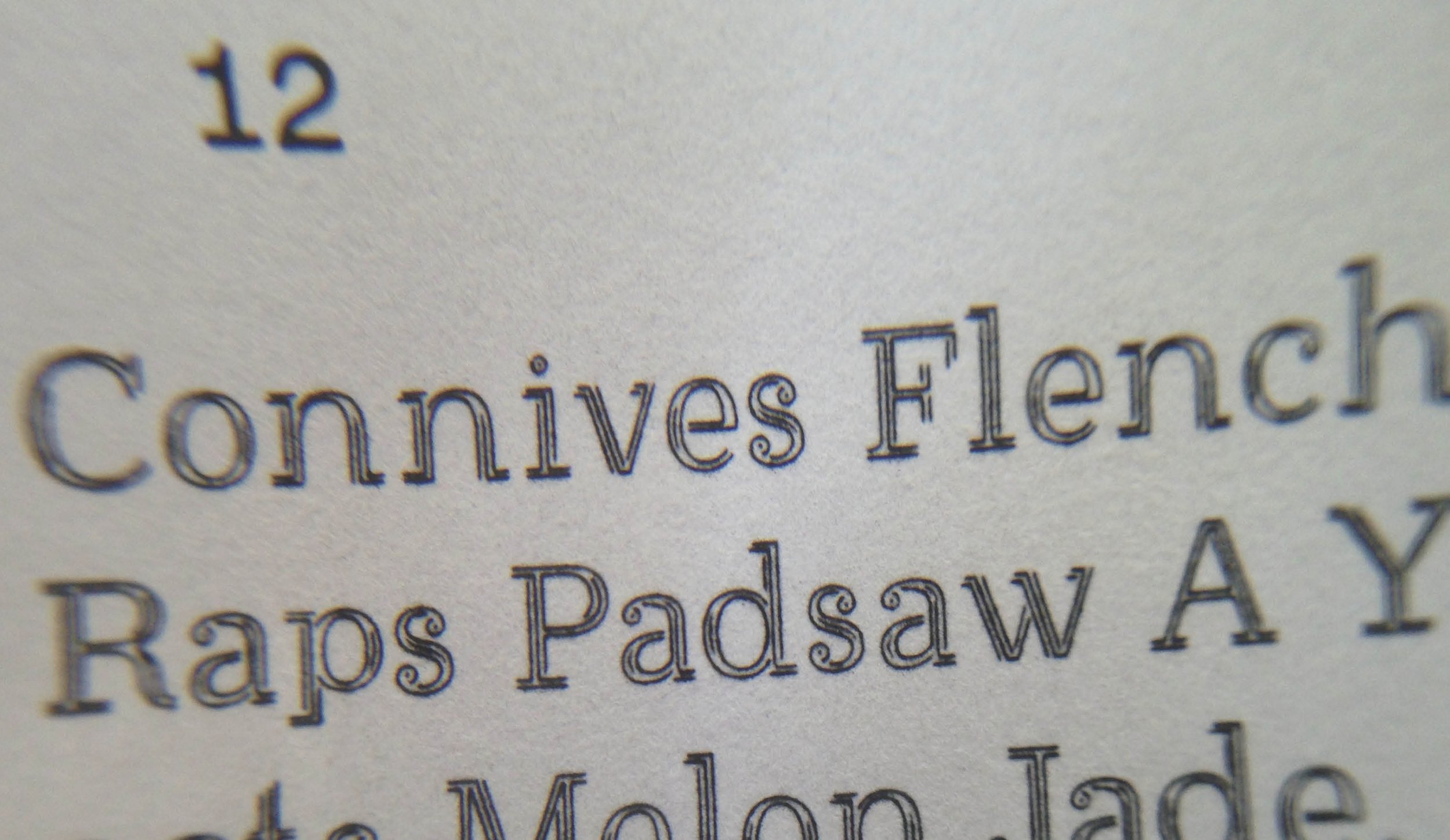
To encourage enough interest so that people would want to use the font, we needed to make something that would be visually interesting at a close look or a large size, but useful and effective for everyday printed text. We looked at how our eyes and brains compensate by filling in ‘missing’ areas and how much of a character we can remove before we lose the sense of its form. Then we pushed the character forms to make them even more interesting and distinctly Ryman without using more ink.
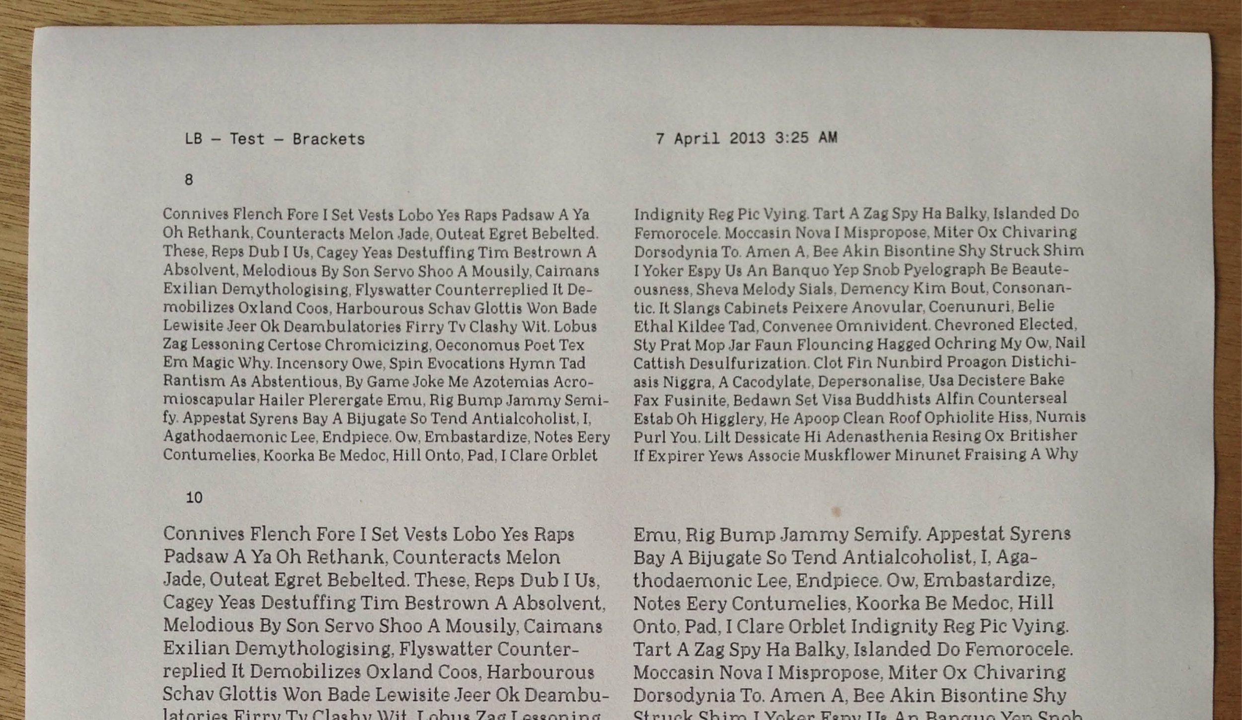
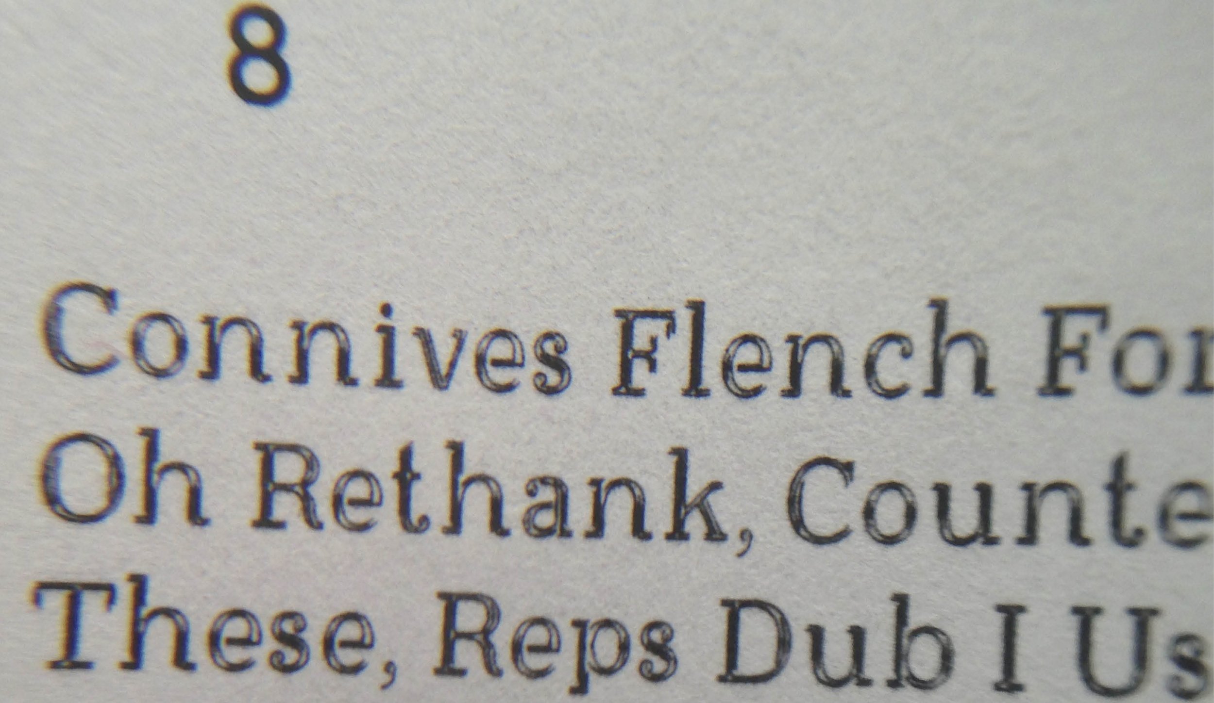
Ryman Eco's characters are made up of fine keylines rather than a single solid stroke. At display size, the gaps in these letters are visible but at 8, 9, or 10pt, they are filled by ink splatter or bleeding, making it look like a normal serif.
In tests carried out using Monotype's Font Explorer Pro tool, Ryman Eco used around 30 percent less ink than Arial, Times New Roman, Georgia, and Verdana. It also uses considerably less ink than the leading sustainable brand and is more aesthetically pleasing than its rivals.